About NACF
Communication Brand
![[NH] is an English Brand separate from “Nong Hyup”,
to be used for communication with customers.
It projects a future-oriented, global NACF.
It consists of the initial letters of NACF’s Romanized Korean name,
Nong Hyup, and symbolizes harmony between nature and humanity and the new hope and
happiness such a harmony would give all.](/eng/images/contents/img_brand_1.jpg)
It is the acronym for Nonghyup's "Nonghyup" and the harmony between nature and man, It is a logo symbolizing new hope and happiness. (New Happiness / Nature & Human / New Hope)
Communication Brand

Color System
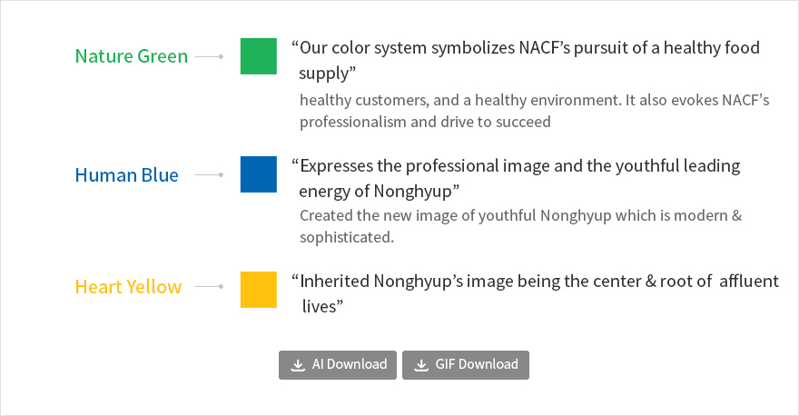
Nature Green-'Our color system symbolizes NACF's pursuit of a healthy food supply' healthy customers, and a healthy environment. It also evokes NACF's professionalism and drive to succeed Human Blue-'Expresses the professional image and the youthful leading energy of Nonghyup' Created the new image of youthful Nonghyup which is modern & sophisticated. Heart Yellow-'Inherited Nonghyup's image being the center & root of affluent lives'
AI Download GIF DownloadGraphic Motive